SIGNAGE AND GRAPHIC GUIDELINE
October 2015 - Quechua - Graphic design with Timothé Blandin - Art direction: Arnault Duhem
SIGNAGE AND GRAPHIC GUIDELINE OF THE NEW HEADQUARTER OF BRANDS QUECHUA, WED’ZE AND SIMOND.
CHALLENGE – Creating a graphic guideline that ensures consistency all over the “Pole Montagne” but also that allows each brand to express themself at their best.
A signage able to inform, guide and make easier orientation and motion in the area.
- Directional signage inside the center.
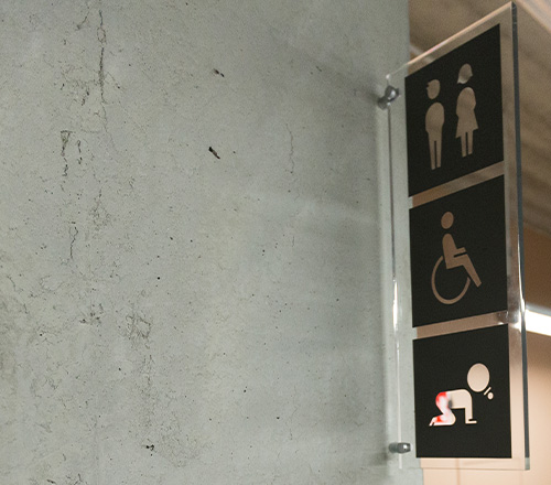
- Functional signage (toilets, room’s names and technical specificity).
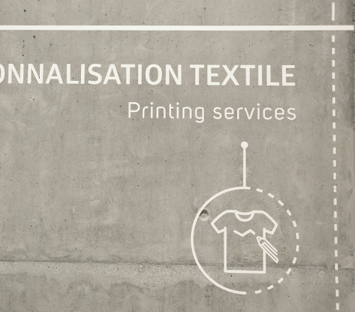
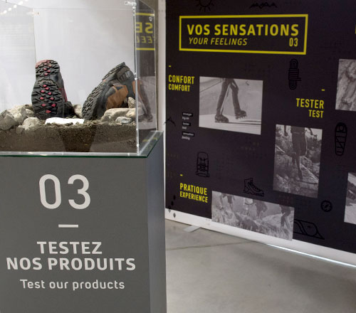
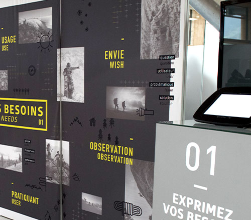
- Technical and informative signage ( in order to communicate conception and innovation to consumers and visitors.
- Creation of a icon library used as a toolkit for several communication medium.
- Ancillary services (restaurant, tourism offices).
- Many others communication likes press articles ….
GUIDELINE
Graphic chart respect full of the building architecture : use of wood, metal, authenticity, white…
Use of simple font with round shapes which represent sweetness and strength of the people who will work there.
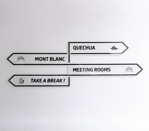
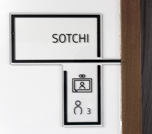
PICTOGRAMS
Unfinished line reminding of all sports linked to every passion brand (hinking, skiing, climbing).
Light drawings to enlighten the respect of both the environment and the spirit of the architectural project.